
Multi-layered maps: Why you shouldn’t make them
Albert Einstein offered three rules of work, the first of which was “Out of clutter, find simplicity.”
More than ever before, campaigns are inundated with a massive amount of data on every voter in their district ranging from demographic breakdowns to sophisticated behavioral models. As they seek to make sense of this library of information, data visualization and maps are an important tool.
People often have an understandable urge to put all their key data on the same map thinking that will pinpoint the best locations for their work.
But Einstein’s rule of work applies, especially when it comes to data visualization and maps. As a mapping platform, we are asked about layering all the time.
Certain complex GIS programs give the user the ability to layer multiple datapoints on to a single map, which in theory will make it more illuminating. But in practice, multilayering usually produces something unreadable like this:

In the above example, we see three datapoints layered on to a single map, producing a muddled mess that can’t be interpreted. The same problem can apply when campaigns try to create the perfect map that layers demographics and voter contact. This is something that we are asked about on a regular basis, but we’ve never seen it done effectively. When you are thinking about what you’d like to map, it’s important to remember that though the technical capability to layer your may exist, it doesn’t mean the outcome will be useful.
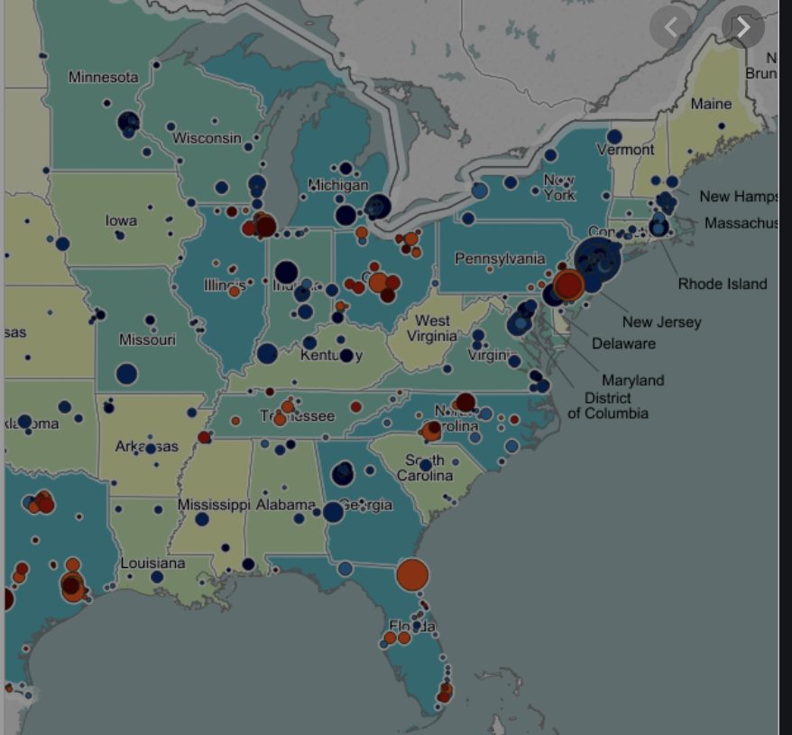
In some cases, layering can be made more comprehendible if certain techniques are used. The map below uses colors and bubbles to differentiate the layers of data. This map showcases the density of a particular population layered on top of the total population of each state. The colors of each bubble represent another factor. You can get a sense of what this map might be showing, but it’s impossible to make any definitive observations from looking at this map. They are mapping too many elements.
We don’t do multiple layers, because a simple side by side comparison is better. Here’s an example:
Let’s assume that you want to view the reach of your texting program in Jackson, MS, to make sure that you’re reaching African American voters. Your impulse might be to layer your voter contact data on top of demographic information.
But as we see below, a side by side comparison provides the simplest way to assess the reach of the program. If you had tried to layer his information, your outcome would be similar to the first example above. In this example, you can look at the two maps side-by-side in two windows and make a quick, comprehendible comparison. Using our platform, you could also do a side-by-side comparison with one wide window.

Our homepage, the “Map Dashboard” is designed with the multi-layer question in mind, making it easy for users to look at multiple things at one time. It has one main map and many small maps that you can look at for comparison. Clicking on any of the small maps will turn that into the main map.

As you begin to assess your mapmaking needs, remember Einstein’s advice. The key to making the most of your effort is to understand what you’re mapping and the overall goal that you’re trying to achieve.
While certain GIS platforms give you the option of layering all your data on one single map, it’s better to keep it simple.