The new Map Wizard
Empower Engine was founded on a basic premise that a map is easier to understand than a spreadsheet.
Our goal has always been to make mapping your data as easy as a few clicks, which will allow your campaign team to make the most of your data, and ultimately build a winning strategy.
Map creation is a visual process.
With that in mind, we’re excited to roll out our new Power Map Wizard, which captures the visual aspect of making your map.
Now with the wizard you’ll watch your map change with every decision you make, helping you see the map as you go. Let’s take a look at an example.
Let’s say you are working for the Wisconsin state party and you wanted to produce a map of the black population in Milwaukee as part of voter turnout efforts in this key 2020 battleground.
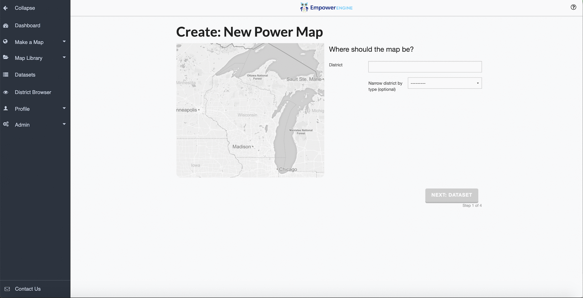
With the new wizard, when you begin the map making process, you start with a map of the jurisdiction for which you have access. In this case, you begin with a map of the state of Wisconsin.
Step 1: Choosing your location
Now watch what happens if I enter Milwaukee in the district field.
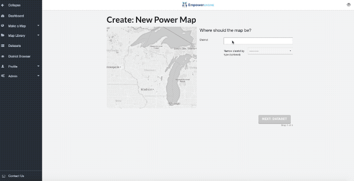
You’ve made your first decision, and the map creation has begun.
Step 2: Choosing your data
In the 2nd step of the map making process, you’ll select your data. While Empower Engine comes pre-loaded with public data, the real beauty is when our clients see their own data -- model scores, nightly VAN field data, etc.
The new wizard has made it easier to comb through your datasets to find the right option.

As you can see from the image below, we’ve provided ten potential datasets, along with a search bar and the dropdowns at the top of the screen to help you filter your results.
If you select the 2010 Census Ethnicity Black dropdown, and select black population, you’ll see your map change. A default name gets set, as does a level of detail, which you can see outlined on the map.
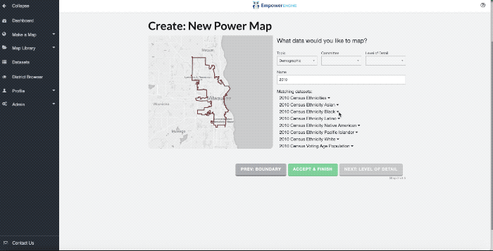
If you’re done with the map, you can select accept and finish and your map will be created.
Step 3: Refining your Level of Detail

On the next screen you’ll be given an opportunity to select your level of detail.
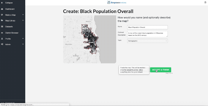
Step 4: Change the name/Add a Description
The wizard allows you an opportunity to change the name of your map, add a description to your map, or change its topic. We highly recommend adding a description if you’re going to share the map to another user.
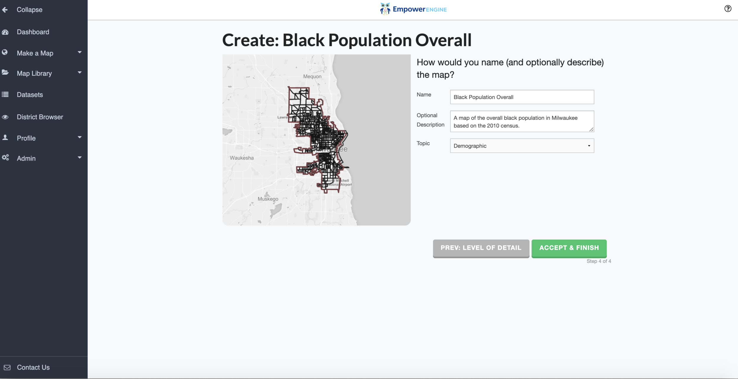
After this final step, your map is ready to be finished.
Step 5: Change the Color or Binning Method
Now that we’ve named the map and added a description, we can change the color or the manner by which the data is organized. When you’re making a map depicting something like the black population, where you want to show population density, it’s wise to use a single color scheme.

When you’re displaying a win margin for election results, you may want to color it Red to Blue using a Zero-Centered binning method and increase the number of bins from 5 to 7.
Now let’s create your map.
Once you create your finished map, you’ll have the same capabilities to change it and share it with members of your team that have defined the Empower Engine platform since our beginning.
We look forward to hearing your feedback on the new Power Map wizard!